This made it easier to drag the handles of my overlying ellipse wedge to the percent I wanted, assuming that 10 points each represents 10%. You could save this guide as a symbol if you plan to use it frequently as I did use it six times. In my case, besides adding the text of each software name in the following, I colored each ellipse to resemble the color of the software icons, and I added a percent as well in case the graph/chart was confusing to the viewer. Refer to Figure 9-10.

Figure 9-10. Create multiple faux pie charts with text to display your skill level in software
These percentages may be based on a proficiency test you recently took or perhaps your own years of experience, which makes you sure that this is your skill level. In your case, you may want to add other non-software skills such as sketching and drawing.
However, you do not want to overwhelm the design with too many pie charts, so pick your top four to six skills.
In this case, I left the charts with the text ungrouped in case you wanted to review my layout. However, remember to use your Selection tool (Shift+Click) for your multiple text or graphics and use the Align panel or the Align options in your Control panel if you want the text to line up and look balanced. Refer to Figure 9-11.
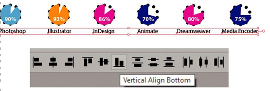
Figure 9-11. Make sure to align selected text using the Control panel
Timelines are a simple way as we saw in Chapter 1 of creating a progression of time. Now in this example, you can use a timeline for your professional employment experience as well as education/training. Refer to Figure 9-12.
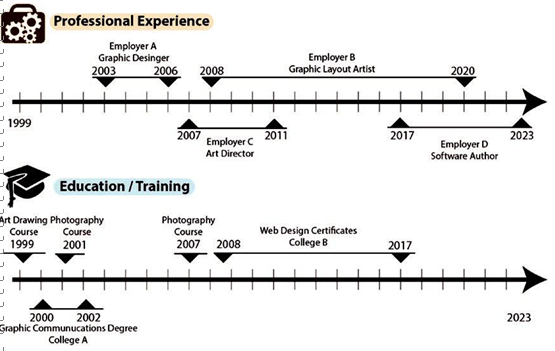
Figure 9-12. Create a timeline of your professional experience and education
This can show the reader that you may have worked several jobs at once or that you were taking multiple training courses at the same time, which when just described as text to the reader of the resume could be confusing. A visual timeline will make the events clearer. In this case, I used the Line Segment tool. Refer to Figure 9-12 and Figure 9-13.
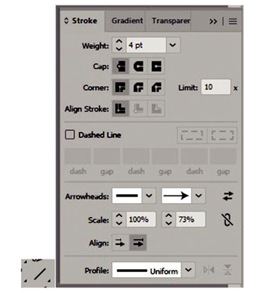
Figure 9-13. Use the Line Segment tool and the Stroke panel to create a timeline
Remember, you can add arrowheads to the main line using the Stroke panel and then adjust the arrowhead scale to make it larger or smaller. Likewise, you can group lines and shape polygon triangles together to show a span of time for a particular employment or course. Then add text either at a point or an area type box that expresses such things as dates, the employer, your title, the school’s name, or the name of the course you attended.
On the timeline, the dividing lines were evenly spaced using the Blend tool. In this case, we are dealing with the years 1999–2023. So there were 22 specified steps or line spaces in between the start and end line segments, giving us 24 segments. Refer to Figure 9-12 and Figure 9-14.

Figure 9-14. Use the Blend tool to blend lines from one end to the other